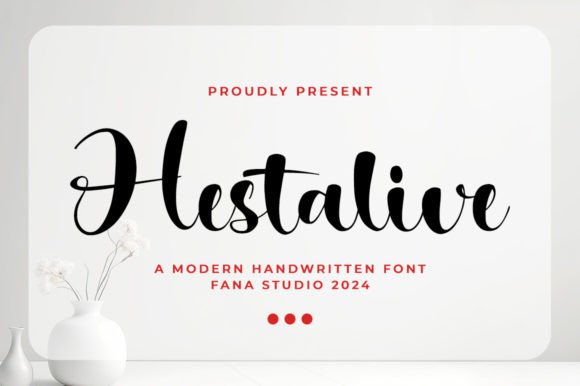
Hestalive: A Modern Script Font for Polished Digital Branding
Two weeks ago, I was finalizing the hero section of a new coaching website — clean layout, soft pastel background, and a headline that needed to feel both warm and authoritative. I’d cycled through six fonts already: one too rigid, another too playful, a third with awkward letter spacing on mobile. Then I dropped in Hestalive. Instantly, the headline softened — not in weakness, but in intention. It carried presence without shouting. That’s when I knew this wasn’t just another script font; it was a deliberate design decision, not decoration.
Hestalive is a premium script typeface from the Script Amp collection — elegant, fluid, and unmistakably modern. Its strokes balance organic flow with subtle structure: generous x-height, gentle tapering, and consistent rhythm across uppercase and lowercase. It doesn’t mimic handwriting — it refines it. There’s no forced quirkiness or exaggerated flourishes. Instead, you get confident curves, even weight distribution, and a quiet sophistication that reads as intentional, not incidental. For digital creators, that nuance matters — especially when building trust before the first sentence is read.
I tested Hestalive across real interface contexts: hero banners over blurred imagery, CTA buttons on light and dark backgrounds, testimonial quotes in card layouts, and even small-label accents in a product grid. In each case, its legibility held up — but only when used thoughtfully. On mobile, I kept it strictly for headlines above 28px. Anything smaller than 24px began to lose clarity in body-weight rendering, especially on OLED screens. For buttons, I reserved it for primary CTAs with ample padding (minimum 16px line height, 48px min height), never for secondary actions or navigation links.
Where Hestalive shines is in brand elevation — not utility. Think: the “Welcome” line above a course sales page, the tagline beneath a logo lockup, the hand-signed flourish in a boutique online store’s email header. It works beautifully in editorial blog headers, campaign landing pages, and portfolio site intros — anywhere you want tone and personality to land before the user scrolls. But I wouldn’t use it for paragraph text, form labels, or pricing tables. That’s not a limitation — it’s alignment with its purpose as a display font, not a workhorse.
Pairing was effortless. With a neutral sans serif like Inter, Manrope, or even system fonts (San Francisco, Segoe UI), Hestalive gained contrast and breathing room. The sans handled information density; Hestalive handled emotional resonance. For a more editorial brand kit — say, a newsletter or content-rich coaching site — I paired it with a refined serif like Literata or Crimson Pro. The contrast created hierarchy without tension: Hestalive set the mood, the serif grounded the message.
On image overlays, I made sure the background had at least 70% opacity behind the text or used a subtle text shadow (1px black at 20% opacity) — never relying solely on contrast alone. And crucially, I checked the webfont delivery: Hestalive includes WOFF2 files, supports Latin-based languages (including accented characters common in European branding), and offers stylistic alternates via OpenType features — handy for customizing “a”, “g”, or swash capitals if your CMS supports CSS font-feature-settings. No variable weight axis, but it ships with one well-tuned weight — which actually helped me avoid overcomplicating typography systems.
Licensing was straightforward: commercial use is included, and the license covers web embedding, digital templates, client projects, and SaaS dashboards — no hidden tiers or usage caps. That mattered when handing off assets to a developer who’d need to self-host or integrate via a font service. I also verified fallback behavior: defining font-family: "Hestalive", system-ui, sans-serif; ensured graceful degradation without layout shifts.
In practice, here’s how it played out across different sections:
- Hero headline: Used at 48px on desktop, 36px on tablet, 32px on mobile — always with tight but readable letter-spacing (–0.5% on desktop, 0% on mobile).
- Section dividers: Small caps version (via OpenType) at 20px, centered above testimonials — added rhythm without competing.
- Digital ads & social banners: Exported as SVG text (not raster) for crisp scaling; avoided thin strokes below 18px in static assets.
- Branded PDFs & email headers: Embedded cleanly in Figma exports and Mailchimp templates — no rendering hiccups across clients.
What surprised me most wasn’t how beautiful Hestalive looked — it’s easy to fall for beauty — but how consistently it supported the user’s journey. On the coaching site, visitors paused longer on the hero. On a product landing page I tested it with later, the “Get Started” button felt more inviting, not flashy. That’s the power of intentional typography: it doesn’t distract, it directs. It doesn’t shout identity — it whispers confidence.
Of course, Hestalive isn’t universal. It won’t suit a fintech dashboard or a medical compliance portal. But for creative businesses — illustrators launching portfolios, wellness coaches refining their voice, boutique brands curating digital touchpoints — it’s a rare blend of artistry and usability. It respects screen constraints while honoring human expression. And in a world of algorithm-driven interfaces, that balance feels quietly revolutionary.
If you’re selecting a script font for your next digital project, ask yourself: does it serve the user’s intent, or just my aesthetic preference? With Hestalive, the answer landed clearly — every time.